How to customize
您可以轻松地自定义一个 Material-UI 组件的外观。
As components can be used in different contexts, there are several approaches to customizing them. 从最狭窄到最广泛的用例,这些是: 从最狭窄到最广泛的用例,这些是:
1. One-off customization
您可能需要为实现特定的组件而更改样式,以下有几种解决方案:
Use the sx prop
The easiest way to add style overrides for a one-off situation is to use the sx prop available on all Material-UI components. 下面是一个示例: 下面是一个示例:
<Slider
  defaultValue={30}
  sx={{
    width: 300,
    color: 'success.main',
  }}
/>
Next you'll see how you can you can use global class selectors for accessing slots inside the component. You'll also learn how to easily identify the classes which are available to you for each of the states and slots in the component. You'll also learn how to easily identify the classes which are available to you for each of the states and slots in the component.
Overriding nested component styles
You can use the browser dev tools to identify the slot for the component you want to override. It can save you a lot of time. You can use the browser dev tools to identify the slot for the component you want to override. It can save you a lot of time. The styles injected into the DOM by Material-UI rely on class names that follow a simple pattern: [hash]-Mui[Component name]-[name of the slot].
⚠️ These class names can't be used as CSS selectors because they are unstable, however, Material-UI applies global class names using a consistent convention: Mui[Component name]-[name of the slot].
让我们回到上面的演示。 How can you override the slider's thumb?
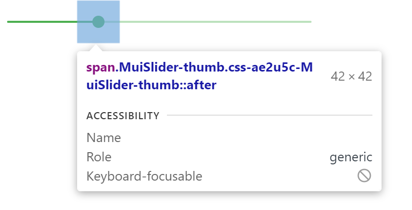
In this example, the styles are applied with .css-ae2u5c-MuiSlider-thumb so the name of the component is Slider and the name of the slot is thumb.
You now know that you need to target the .MuiSlider-thumb class name for overriding the look of the thumb:
<Slider
  defaultValue={30}
  sx={{
    width: 300,
    color: 'success.main',
    '& .MuiSlider-thumb': {
      borderRadius: '1px',
    },
  }}
/>
用类名(class names)覆盖样式
If you would like to override the styles of the components using classes, you can use the className prop available on each component. For overriding the styles of the different parts inside the component, you can use the global classes available for each slot, as described in the previous section. For overriding the styles of the different parts inside the component, you can use the global classes available for each slot, as described in the previous section.
You can find examples of this using different styles libraries in the Styles library interoperability guide.
CSS 伪类(Pseudo-classes)
组件会有一些特殊的状态,如 hover ,focus ,disabled 和 selected ,它们被一些更高的 CSS 特异性所装饰。 优先级是一种加权,它适用于给定的 CSS 声明。
为了覆盖组件的特殊状态,你会需要提高特殊性 。 下面是一个示例,它展示了 disabled 状态,以及一个使用伪类的按钮组件(disabled):
.Button {
  color: black;
}

/* Increase the specificity */
.Button:disabled {
  color: white;
}<Button disabled className="Button">Sometimes, you can't use a pseudo-class, as the state doesn't exist in the web specification. 我们以菜单项(menu item)组件和 selected 状态为例。 我们以菜单项(menu item)组件和 selected 状态为例。 You can use the .Mui-selected global class name to customize the special state of the MenuItem component:
.MenuItem {
  color: black;
}

/* Increase the specificity */
.MenuItem.Mui-selected {
  color: blue;
}<MenuItem selected className="MenuItem">为什么我需要增加优先级来覆盖一个组件的状态呢?
通过一些设计,CSS 的一些特殊要求让伪类提高了优先级。 For consistency with native elements, Material-UI increases the specificity of its custom pseudo-classes. 这有一个重要的优点,您可以自由挑选那些想要自定义状态。 这有一个重要的优点,您可以自由挑选那些想要自定义状态。
What custom pseudo-classes are available in Material-UI?
You can rely on the following global class names generated by Material-UI:
| State | 全局类名 |
|---|---|
| active | .Mui-active |
| checked | .Mui-checked |
| disabled | .Mui-disabled |
| error | .Mui-error |
| focused | .Mui-focused |
| focus visible | .Mui-focusVisible |
| required | .Mui-required |
| expanded | .Mui-expanded |
| selected | .Mui-selected |
⚠️ Never style these pseudo-class class names directly:
/* ❌ NOT OK, impact all the components with unclear side-effects */
.Mui-error {
  color: red;
}

/* ✅ OK */
.MuiOutinedInput-root.Mui-error {
  color: red;
}
2. Reusable style overrides
If you find that you need the same overrides in multiple places across your application, you can use the experimentalStyled() utility for creating a reusable component:
import * as React from 'react';
import Slider from '@material-ui/core/Slider';
import { alpha, experimentalStyled } from '@material-ui/core/styles';

const SuccessSlider = experimentalStyled(Slider)(({ theme }) => ({
  width: 300,
  color: theme.palette.success.main,
  '& .MuiSlider-thumb': {
    '&:hover, &.Mui-focusVisible': {
      boxShadow: `0px 0px 0px 8px ${alpha(theme.palette.success.main, 0.16)}`,
    },
    '&.Mui-active': {
      boxShadow: `0px 0px 0px 14px ${alpha(theme.palette.success.main, 0.16)}`,
    },
  },
}));

export default function StyledCustomization() {
  return <SuccessSlider defaultValue={30} />;
}
With it, you have access to all of a component's props to dynamically style the component.
3。 Dynamic variation
In the previous section, we learned how to override the style of a Material-UI component. 现在,让我们看看我们如何使动态地应用这个覆盖。 现在,让我们看看我们如何使动态地应用这个覆盖。 Here are four alternatives; each has its pros and cons.
动态 CSS
<React.Fragment>
  <FormControlLabel
    control={
      <Switch
        checked={vars === successVars}
        onChange={handleChange}
        color="primary"
        value="dynamic-class-name"
      />
    }
    label="Success"
  />
  <CustomSlider style={vars} defaultValue={30} sx={{ mt: 1 }} />
</React.Fragment><React.Fragment>
<FormControlLabel
control={
<Switch
checked={success}
onChange={handleChange}
color="primary"
value="dynamic-class-name"
/>
}
label="Success"
/>
<ThemeProvider theme={theme}>
<Slider defaultValue={30} sx={{ width: 300, mt: 1 }} />
</ThemeProvider>
</React.Fragment>4、 全局化主题变体
为了提高组件之间的一致性,并整体化管理用户界面外观,Material-UI 提供了一种能够应用全局变更的机制。
Please take a look at the theme's global overrides page for more details.
5、 全局 CSS 覆盖
Components expose global class names to enable customization with CSS.
.MuiButton-root {
  fontsize: '1rem';
}
You can reference the Styles library interoperability guide to find examples of this using different styles libraries or plain CSS.
If you just want to add some global baseline styles for some of the HTML elements, you can use the GlobalStyles component. Here is an example of how you can override styles for the h1 elements.
<React.Fragment>
  <GlobalStyles styles={{ h1: { color: 'grey' } }} />
  <h1>Grey h1 element</h1>
</React.Fragment>
If you are already using the CssBaseline component for setting baseline styles, you can also add these global styles as overrides for this component. Here is how you can achieve the same by using this approach.
<ThemeProvider theme={theme}>
  <CssBaseline />
  <h1>Grey h1 element</h1>
</ThemeProvider>