How to customize
Вы можете легко настроить внешний вид компонента Material-UI.
As components can be used in different contexts, there are several approaches to customizing them. Переходя от самого нераспространённого варианта к самому широко используемому, это:
- One-off customization
- Reusable style overrides
- Dynamic variation
- Глобальное изменение темы
- Глобальное переопределение CSS
1. One-off customization
Возможно, вам придется изменить стиль компонента в конкретном месте. Для этого вам предоставляются следующие методы:
Use the sx prop
The easiest way to add style overrides for a one-off situation is to use the sx prop available on all Material-UI components. Here is an example:
<Slider
  defaultValue={30}
  sx={{
    width: 300,
    color: 'success.main',
  }}
/>
Next you'll see how you can you can use global class selectors for accessing slots inside the component. You'll also learn how to easily identify the classes which are available to you for each of the states and slots in the component.
Overriding nested component styles
You can use the browser dev tools to identify the slot for the component you want to override. It can save you a lot of time. The styles injected into the DOM by Material-UI rely on class names that follow a simple pattern: [hash]-Mui[Component name]-[name of the slot].
⚠️ These class names can't be used as CSS selectors because they are unstable, however, Material-UI applies global class names using a consistent convention: Mui[Component name]-[name of the slot].
Вернемся к упомянутому выше примеру. How can you override the slider's thumb?
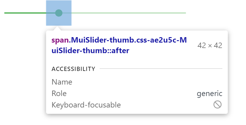
In this example, the styles are applied with .css-ae2u5c-MuiSlider-thumb so the name of the component is Slider and the name of the slot is thumb.
You now know that you need to target the .MuiSlider-thumb class name for overriding the look of the thumb:
<Slider
  defaultValue={30}
  sx={{
    width: 300,
    color: 'success.main',
    '& .MuiSlider-thumb': {
      borderRadius: '1px',
    },
  }}
/>
Переопределение стилей через имена классов
If you would like to override the styles of the components using classes, you can use the className prop available on each component. For overriding the styles of the different parts inside the component, you can use the global classes available for each slot, as described in the previous section.
You can find examples of this using different styles libraries in the Styles library interoperability guide.
Pseudo-classes
Особые состояния компонент, такие как * наведение (hover)*, * фокус *, disabled и selected, стилизованы при помощи CSS с более высокой специфичностью. Специфичность - это весовой коэффициент применяемый к данной декларации CSS.
Чтобы переопределить особые состояния компонентов, вам нужно увеличить специфичность. Вот пример с disable состоянием и компонентом кнопка использующим псевдокласс (:disabled):
.Button {
  color: black;
}

/* Increase the specificity */
.Button:disabled {
  color: white;
}<Button disabled className="Button">Sometimes, you can't use a pseudo-class, as the state doesn't exist in the web specification. В качестве примера можно привести компонент пункт меню и состояние выбрано. You can use the .Mui-selected global class name to customize the special state of the MenuItem component:
.MenuItem {
  color: black;
}

/* Increase the specificity */
.MenuItem.Mui-selected {
  color: blue;
}<MenuItem selected className="MenuItem">Почему я должен повышать специфичность для переопределения отдельного состояния компонента?
Спецификация CSS, по определению, обязывает псевдоклассы повышать специфичность. Спецификация CSS, по определению, обязывает псевдоклассы повышать специфичность. Это имеет одно важное преимущество: оно позволяет выбрать определённое состояние, которое вы хотите изменить.
What custom pseudo-classes are available in Material-UI?
You can rely on the following global class names generated by Material-UI:
| State | Global class name |
|---|---|
| active | .Mui-active |
| checked | .Mui-checked |
| disabled | .Mui-disabled |
| error | .Mui-error |
| focused | .Mui-focused |
| focus visible | .Mui-focusVisible |
| required | .Mui-required |
| expanded | .Mui-expanded |
| selected | .Mui-selected |
⚠️ Never style these pseudo-class class names directly:
/* ❌ NOT OK, impact all the components with unclear side-effects */
.Mui-error {
  color: red;
}

/* ✅ OK */
.MuiOutinedInput-root.Mui-error {
  color: red;
}
2. Reusable style overrides
If you find that you need the same overrides in multiple places across your application, you can use the experimentalStyled() utility for creating a reusable component:
import * as React from 'react';
import Slider from '@material-ui/core/Slider';
import { alpha, experimentalStyled } from '@material-ui/core/styles';

const SuccessSlider = experimentalStyled(Slider)(({ theme }) => ({
  width: 300,
  color: theme.palette.success.main,
  '& .MuiSlider-thumb': {
    '&:hover, &.Mui-focusVisible': {
      boxShadow: `0px 0px 0px 8px ${alpha(theme.palette.success.main, 0.16)}`,
    },
    '&.Mui-active': {
      boxShadow: `0px 0px 0px 14px ${alpha(theme.palette.success.main, 0.16)}`,
    },
  },
}));

export default function StyledCustomization() {
  return <SuccessSlider defaultValue={30} />;
}
With it, you have access to all of a component's props to dynamically style the component.
3. Dynamic variation
In the previous section, we learned how to override the style of a Material-UI component. Теперь давайте посмотрим, как мы можем сделать эти переопределения динамическими. Here are four alternatives; each has its pros and cons.
Динамический CSS
<React.Fragment>
  <FormControlLabel
    control={
      <Switch
        checked={vars === successVars}
        onChange={handleChange}
        color="primary"
        value="dynamic-class-name"
      />
    }
    label="Success"
  />
  <CustomSlider style={vars} defaultValue={30} sx={{ mt: 1 }} />
</React.Fragment><React.Fragment>
<FormControlLabel
control={
<Switch
checked={success}
onChange={handleChange}
color="primary"
value="dynamic-class-name"
/>
}
label="Success"
/>
<ThemeProvider theme={theme}>
<Slider defaultValue={30} sx={{ width: 300, mt: 1 }} />
</ThemeProvider>
</React.Fragment>4. Глобальное изменение темы
In order to promote consistency between components, and manage the user interface appearance as a whole, Material-UI provides a mechanism to apply global changes.
Please take a look at the theme's global overrides page for more details.
5. Глобальное переопределение CSS
Components expose global class names to enable customization with CSS.
.MuiButton-root {
  fontsize: '1rem';
}
You can reference the Styles library interoperability guide to find examples of this using different styles libraries or plain CSS.
If you just want to add some global baseline styles for some of the HTML elements, you can use the GlobalStyles component. Here is an example of how you can override styles for the h1 elements.
<React.Fragment>
  <GlobalStyles styles={{ h1: { color: 'grey' } }} />
  <h1>Grey h1 element</h1>
</React.Fragment>
If you are already using the CssBaseline component for setting baseline styles, you can also add these global styles as overrides for this component. Here is how you can achieve the same by using this approach.
<ThemeProvider theme={theme}>
  <CssBaseline />
  <h1>Grey h1 element</h1>
</ThemeProvider>